

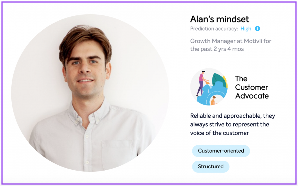
At CULTURED we like to ask seasoned professionals in the People space about their learnings when dealing with data, people and teams. We recently asked Alan Wanders, Growth Manager at Motivii, about his take on how to make the best use of Data in the workplace here are his thoughts. We’re very thankful he took the time to put together this guest post on the basics of using People Data to make company decisions. We hope this sparks new ideas for your team!
“I love data!”, people tell me.
But what do they really mean?
Telling someone that you love data is – technically speaking – equivalent to saying that you’re really enjoying the ability to hear, smell, taste, touch and see.
I love data: that’s why I wait at London Bridge station, making a note of the serial numbers on the trains that go by.
I love data: that’s why I jump on the chance to try newly invented flavours of crisps whenever I go to the supermarket.
I love data: that’s why I’ve decided to roll myself up in the rug in your living room to collect information about how the material feels.
The people I’m talking about probably weren’t talking about these examples of data collection. They probably meant that the insights offered by a new tool or integration offered some value to their work or life.
But I’m not just being pedantic here. It’s important to be clear on what you’re actually talking about when you talk about data.
‘Data’ refers to a lot of different things, and some are less loveable than others. Not all data is good data, not all data is representative, not all data is helpful, and not all data is easy to understand or explain.
I’ll be focusing on how to make sure your team understands how the people department uses people data to make decisions.
But first, it’s worth outlining the different levels of involvement with data that People departments tend to have. I’ve spotted three stages…
Stage One: Observing data because it’s nice to have
“Ooohh! Data! Look, it’s coming through! Lovely!”
Like the early scenes in Willy Wonka’s Chocolate Factory, getting a bit of data on how your employees are doing is a heady experience.
Although it’s in plain sight, there is an understanding that the data should not yet be touched or acted on, or else a child will turn blue or be sucked from a chocolate river into a pipe that’s slightly less wide than they are. You get the picture.
The possibility that the data offers is exciting, but the insights probably won’t leave the People department – for now.
Stage Two: Using data to support operations
Once the initial trepidation wears off, the People department will hopefully begin to use People Data to improve existing processes.
Whether it’s employee feedback from surveys, or productivity data based on Slack activity, data nudges, demonstrates & disproves. It presents how people think or feel about work plainly, and it makes you think twice about the assumptions you have of where you work.
This is probably the most important stage because it helps the People department make real changes, run experiments, and test the overall effectiveness of their efforts.
So instead of weaving an extremely thin story from the results of each annual survey (data nobody loves), the People department now have access to rolling results to how people feel, what they’re working on, and even how their company is likely to feel in the future.
That paints a much more compelling story about how the company is doing over time and brings the People department’s input much more relevant to business objectives.
For example, they’ll be able to say things like, “By reducing regrettable attrition by 30%, overall productivity has increased by 20%.”
You don’t need spaceship-level volumes of data to put these correlations together. It just requires a little preparation, some focus on the most important things you want to track, and access to tools that collect the info that matters.
Keep asking yourself: what does this tell me about my company’s overall strategy?
Stage Three: Using data to make people decisions
So you’ve decided to go full-throttle on People Data.
You’re using People Data as a reliable sidekick to help you make People decisions. Here’s why you should tread carefully since it could lead to some awkward situations:
Employee: “Why haven’t I been chosen for the leadership program?”
People Department: *Checks notes* Your employee potentiality score is below what it should be.
Employee: “What’s an employee potentiality score? I’m hitting all my KPIs…?”
People Department: It’s a… *Hurriedly checks notes* I’ll follow up with you on that later.
While the insight engine chugs away in the People department, employees aren’t clear on what categories it has put them into, how this will affect them, and what they can do to improve.
There are two issues here: The first is a communication issue and the second is an understanding issue.
Between dashboards, reports, and predictive analysis, it can be difficult to tell the difference between what data appears to say, and its actual significance. It’s too easy to become complacent in the face of uncertainty: we think data is concrete & self-evident, which falsely reassures us.
In reality, People Data is just an output. Unless the steps that lead to that output are watertight, and the output is understood within this context, it might not be effective.
Understanding People Data: The Basics
Whenever I look at data, I try to take as many steps back as possible before trying to interpret what I’m seeing.
- What does a score of 7.1/10 mean in response to the question, “How stressed are you at work?”
- And what does a score of 7.1/10 mean in response to the question, “What do you think of your new office?”
Although answers to these questions are essentially the same, they might have very different weightings. For the same employee, team, or company, 7.1 might be an incredibly high indicator of stress and a very luke-warm indicator of how they feel about their office.
Instead, the best way to interpret this data is to compare like-with-like. Any previous recordings give valuable context to whether 7.1 is a good score. It’s more helpful to think in terms of improvements & regressions, as opposed to the absolute primacy of individual scores.
Add benchmarking, and you’ll have an external ‘does this score look right?’ measure, as well as an indication of how you compare to your industry or self-determined targets.
For example, the weekly motivation score employees input via Motivii is calculated as relative to each individual’s desired motivation, which they update each quarter. This calculates a meaningful deviation from individuals’ benchmarks, which takes into account employees’ different interpretations of what ‘motivation’ means, and what’s a good/average/bad score for them.
At Motivii we’ve found that sales teams rate their desired motivation at about 90%, while engineering teams add their desired motivation at about 70%. A score of 80% would, therefore, mean something very different to each of these teams.
So – take a few steps back before diving into data. Or you might spend a long time tracing your steps later on.
Communicating People Data: The Basics
Josh Bersin recently spoke about the need for more non-HR professionals in HR, to bring knowledge of how to read data, build analysis, and improve processes. But I think he misses a trick…
In large organisations, it makes sense to have dedicated HR Analytics teams, but in smaller companies, data handling should be a skill available to anyone. It’s much more difficult to teach someone soft skills like managing expectations of progression, conflict resolution, and performance management than it is to teach someone how to interpret data.
Now the two are linked, some people leaders worry they won’t be able to upskill quickly enough. In reality, they’ve already done the hard work – and their use of data should dovetail with their processes for handling engagement, performance, etc.
If an employee asks how, or why, a data set is significant, you should know exactly what the data represents, what could be driving it, and how the score is calculated.
Workshops on interpreting data are a great way of giving the people department these capabilities, but I’d recommend avoiding the question entirely by giving employees access to their own insight.
Giving employees access to their own insight does three very important things: it improves transparency (employees can see what people departments see), it improves accountability (employees know & can explain their results), and it encourages proactiveness (employees can influence their own results before the People department steps in).
Communicating People Data effectively is as important as data gathering, because it determines how insight is perceived, how employees feel about giving open feedback, and how effective any decisions based on that data will be.
Plus, when you tell people you love data, they’ll agree with you, knowing exactly what you mean.
Thanks for checking out our blog! We publish new interviews and articles regularly with People leaders from Fortune 500 companies, hyper-growth startups, and everything in-between. To stay in the loop, subscribe to our email newsletter here: Beyond the obvious: Hacks for high-performance leaders and teams.
Cover photo by Curtis MacNewton on Unsplash


